Saturday 29 March 2014

Pure Experimentation With Old Camera

I recently acquired a Canon EOS 300 (analogue), which my mother had bought over eBay a while back, and a simple Yashicka T3, which had belonged to my stepfather's mother. As Oxford's weather has been quite temperamental recently, I decided to take some photos of my local area. The fog that last for a few days allowed for some dramatic images, and the clearer days brought a few picturesque sunsets. Below are scanned versions of the developed photographs. Naturally the non-scanned versions look better. These images have not been edited- the effect on the eighth photograph was created by accidentally exposing the film in the camera prematurely. I think it looks quite interesting.

I think that these could make an interesting album cover. It could be argued that none of these literally correspond to the album name "Mother Cocaine", but a wide range of album covers have the same 'issue'- Panic! At The Disco's A Fever You Can't Sweat Out, Marina and the Diamonds' The Family Jewels, Sting's The Dream of the Blue Turtles- none of them have literal manifestations of the album name. I believe this to be more interesting and artistic.

Wednesday 26 March 2014

Indie Album Cover Shoot *unfinished*


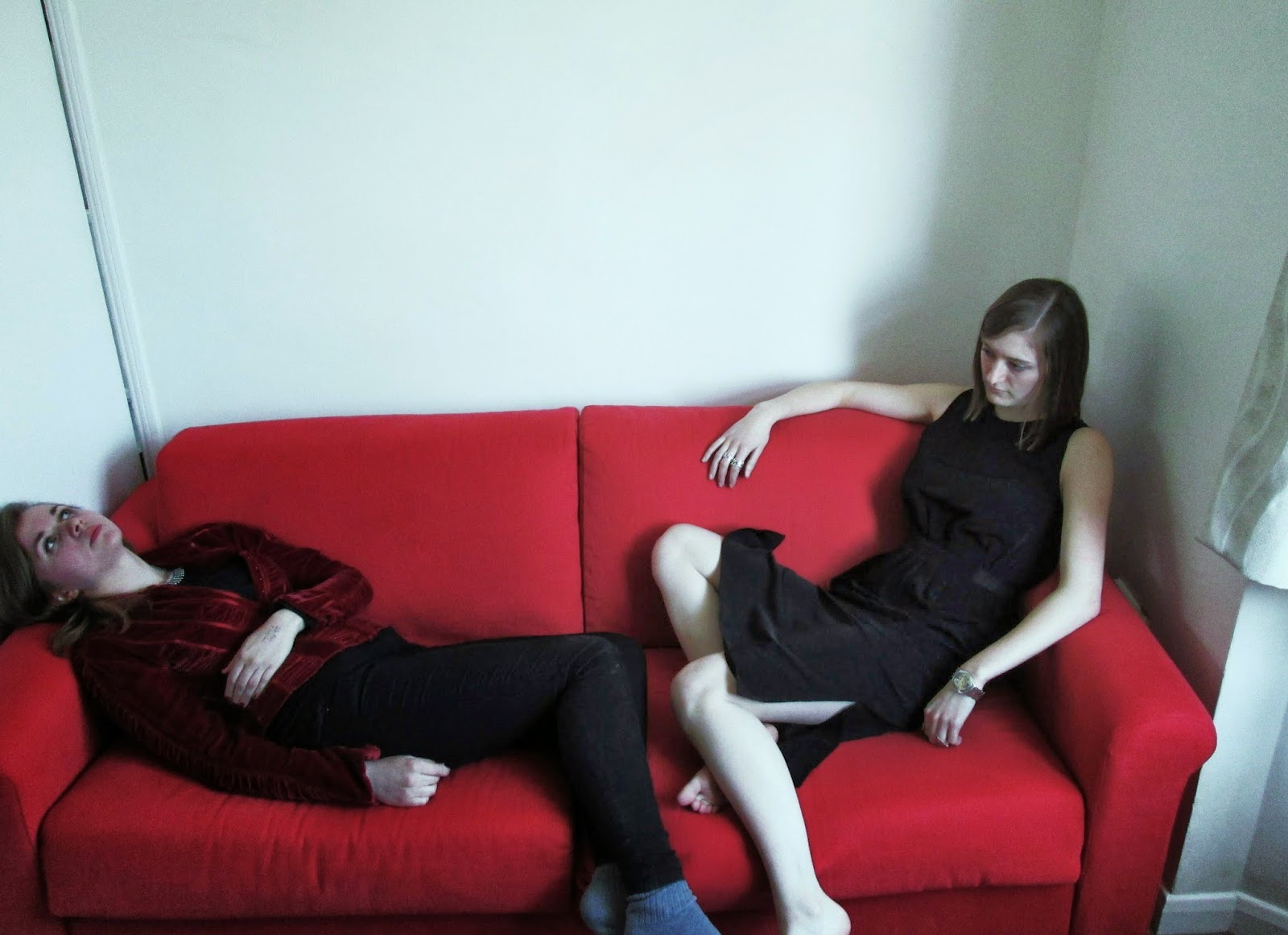
These photo are a lot more indie than their predecessors. I selected the red velvet jacked for Emma to wear as it is vintage and unique, sort of like the indie genre- it was a reaction to the 'macho culture' that formed after Nirvana's success My media teacher and I both really like the the purple edited image- it looks trippy and inverted, the perfect style for the indie genre. However, as the Coronas are an all male band and have a male singer, we would need at one man in the shoot to make it believable. Despite this, indie rock is noted for having a relatively high proportion of female artists compared with preceding rock genres, a tendency exemplified by the development of the feminist-informed Riot Grrrl music of acts like Bikini Kill, Bratmobile, 7 Year Bitch, Team Dresch and Huggy Bear. So, for the final shoot, I will make the setting more interesting, use props and have 'blokes' present.

Punk/Grunge Album Art

The Punk era saw the rise of all girl bands, and the album covers often featured the women of the band representing the genre. Examples of the genre, contemporary and preceding, include: Slant 6, Bikini Kill, Dum Dum Girls, Gore Gore Girls, Haim, Joan Jett, Lunachicks, The Slits. In order to re-create this grunge/punk style, I analyzed what clothing constituted the look and  dressed Emma and Katy in appropriate pieces. As a fan of grunge and punk, I already owned some clothing  that could be used. 


I am quite pleased with the way these photographs turned out. Unfortunately, the band that wrote our song are not punk/or grunge, but I wanted to experiment with the moods created and the messages sent when dressed in a certain way/set in a certain place. The aim was reflect the what the music of that genre was about. Lines like "Sometimes being happy baby is what I'm most afraid of", "I don't give a damn about my reputation" and others of a similar vein present a vicious, rebellious attitude towards life, not something commonly associate with indie. Nonetheless, I enjoyed taking dressing Emma + Katy up and taking the photos immensely.
Next time, I will dress Emma and Katy in more 'indie' clothes and place them in more indie appropriate settings.

Gotye 'Like Drawing Blood' Inspiration

I really like Gotye's album covers- they are usually abstract paintings/artwork that he himself has done. 'Like Drawing Blood' has quite a dramatic and violent cover, fitting well with its title- something I would like to do. Below are some photographs I took in response to Gotye's artwork.


Method/Set-up
I used liquid glucose mixed with red food colouring to make a thick, blood-like paste before dipping my hand in the mixture and smearing the walls and bath with it. For the drip and splatter effect in the first image, I let the black liquid drip from my fingers- it wasn't as well mixed as the red. The other effect was achieved by pouring the mix into Emma's cupped hands and waiting for it to trickle through the gaps in her fingers. The two penultimate pictures occurred while I was attempting to clean the walls with water and shower cleaner, diluting the glucose/food colouring, making it runny. It looked too disgusting and creepy not to take a picture.

Evaluation
Overall, I think the photos turned out well. They would all make interesting album covers, although perhaps not for our album- they're a little too crass for what we are attempting to do with our album. On the other hand, that dichotomy could work. However, both 'Crucify, Judge But Don't Pity' and 'Tyrant's Taste' have violent connotations, so I think that with the correct editing and font these images could work well as an album cover.
* U N F I N I S H E D *

Sunday 16 March 2014

Pinterest Moodboard For Advert and Album Cover

Follow Maria's board Moodboard For Advert on Pinterest.

I created a Moodboard on Pinterest to show all the different images, influences, and inspirations that went into the creation of the album/advert. Some of the images I uploaded myself, but most of them I 're-pinned' from other people using Pinterest. The images are a collection of dark, black and white pictures with bursts of colour in between to show the difference and contrast of the indie genre. Indie music has grown to encompass many different styles from Gothic pop to metal, something I tried to reflect with photographs of different tattoos. I included some images of artists such as Dali and Damien Hirst to show the artistic influences that pervade the indie genre. Artists such as Fleet Foxes Tame Impala and Gotye have all artistic influences in the creation process of their albums. A scene from 'In Bruges' is pinned because it references cocaine, part of the name of the album. Next to it is a photograph of Johann Hölzel aka Falco, an Austrian singer who partially inspired the name of the album. I included some interesting adverts as inspiration for the adverts we were to make for the album- some are related to music, some are not. I also included images of some of my favourite artists.

Saturday 15 March 2014

Ideas For Album Artwork/Digipak

 I decided to brainstorm via a mindmap some ideas that could possibly work as an album cover, split into two different sections: one centered around books/literature thus leaning towards a concept album, and the other being more general or 'random'. The green pen indicates the albums that I took inspiration from.

One of my ideas (top center, first arrow off 'Books') is to copy the iconic white and orange Penguin Classic cover, but to alter the title and author to album name and artist. As this was fairly quick and easy, I decided to give it a go. Below is the result.
The font is different as the original font, Gills Sans, is under copyright, forcing me to use Arial instead. Nonetheless, I think it looks convincing and would make an interesting album cover albeit very simple and easy to produce. I feel that this would be an original album cover while conforming to the indie genre- it goes against the grain of pop-culture, so few people, especially teenagers, read books anymore. I have not seen this idea for a CD cover yet, so I believe it to be original. However, one must remember that we have to produce the rest of the digipak and a website or magazine cover. 

Our Digipak Designs

One of our preliminary ideas was to have a long shot of an empty room with a long, banquet-style table with a man sitting/standing at one end, facing the vacant seat opposite. This idea could be developed further through photo-manipulation: In the second picture, the three different colours represent three 'scenes'. All of the drawings in blue are part of the first scene described above. Black is the addition to the scene, the woman. Red marks the table "shrinking" and the two people coming closer together.We thought the contradiction of the title and the picture would not only conform to "Indie" music conventions, but also be a thought-provoking image. 
I thought for the actual setting of this scene could be in an opulent/decorative room 


Inspiration For Our Album

The indie genre is very broad and generally aims to subvert the conventions of mainstream/popular music. Therefore, we have decided to have our album influenced by literature. We wanted to have the album's focus on something that we both enjoyed with equal measure, soon realizing that we took AS English Literature together and loved The Great Gatsby. Thereafter we decided that we would each choose books that we liked and pull quotations from the text (one from each book). We unanimously decided that the band would be called 'Voice Full Of Money', the description Gatsby offers Nick of Daisy, his one true love.
The books I chose were The Master and Margarita, Crime and Punishment, One Day In The Life of Ivan Denisovich and The Bloody Chamber, with a quotation from each, with an additional one from The Master and Margarita. Conall chose Paddy Clark Ha Ha Ha, The Curious Incident of the Dog in the Nightime, On Green Dolphin Street, War Horse. Each quotation would provide the name of a track, so we ended up with:
1) Gold Coloured Tie
2) Tyrant's Taste
3) Bonjour Joey
4) Shadow of My Sword
5) Why Fit In When You Were Born To Stand Out
6) Crucify, Judge, But Don't Pity
7) Peace On Earth For A Heartbeat
8) Waxwork Of Stillness
9) Nothing To Do But Wait And Hurt
10) 18 Below
11) It Was My Own Silence
12) Love Leapt Like A Murderer
13) Dreaming Was Nice While It Lasted
 For the back image of the digipak, we thought we would have each title paired with an image that represents it eg. '18 Below' will be represented by a thermometer showing 18 degrees below zero, and so on and so forth. This idea had previously been for the album cover, but it was decided that the cover should be simple and effective, rather than overcrowded and busy.

'Sgt Pepper's Lonely Hearts Club Band' Album Cover Analysis


Perhaps the most iconic album cover ever, The Beatles' Sgt. Pepper's Lonely Hearts Club Band is one of the best selling albums of all time. The Grammy-winning artwork art-directed by Robert Fraser, designed by Peter Blake and Jann Haworth, his wife and artistic partner, and photographed by Michael Cooper.
Originally, the Beatles already had a cover designed by a Dutch group called the Fool, but Peter Blake's gallery dealer, Robert Fraser suggested to Paul that they should use a 'fine artist, a professional' to do the cover instead. Liking the idea, Paul asked Blake to do it. The concept of the album had already evolved: it would be as though the Beatles were another band, performing a concert. Paul and John told Blake to imagine that the band had just finished the concert, perhaps in a park. Blake thought that they could have a crowd standing behind them, and this then developed into the collage idea. Blake asked them to make lists of people they'd most like to have in the audience at the imaginary concert. John's was interesting because it included Jesus and Ghandi, and more cynically, Hitler. But this was just a few months after the US furor about his 'Jesus' statement, so they were left out. George's list was all gurus, and Ringo said "Whatever the others say is fine by me", because he didn't want to be bothered. Fraser and Blake also made lists and then collected photographs  and had life-size cutouts made onto hardboard. EMI realized that because many of people they were depicting were still alive, they might be sued for not seeking their permission. Therefore, the manager of the Beatles, Brian Epstein,  had  his assistant write to everyone. Mae West replied, "No, I won't be on it. What would I be doing in a lonely hearts club?". So the Beatles wrote her a personal letter and changed her mind. Fraser was a business partner of Michael Cooper, an excellent photographer, so he was commissioned to do the shoot. Blake worked in his studio for  a fortnight, decided to create a tiered effect of the audience. He decided to add waxworks of the Beatles because they might be watching Sgt. Pepper's band too. The boy who delivered the floral display asked if he could contribute by making a guitar out of hyacinths, and the little girl wearing the 'Welcome Rolling Stones, Good Guys' sweatshirt was a cloth figure of Shirley Temple, the shirt coming from Michael Cooper's young son, Adam. The Beatles arrived on the evening of March 30th and the shoot took about three hours, including shots for the centerfold and the back cover. Figures vary on the cost, but it is believed to have cost £3000, around £46, 104 today. Fraser was paid £1500 and  Blake £200.
The Beatles had insisted that everything on Sgt. Pepper's Lonely Hearts Club Band had to be different. This presented a tremendous challenge, and, in the words of George Martin, 'a highly rewarding experience'. Perhaps it is the album's total originality, innovation, imagination that made it such a trend-setting and iconic record.

Sunday 2 March 2014

Media Theory Case Studies Summary


My case studies focus on the representation of women in American science-fiction television series, specifically Star Trek. I focus on Uhura from Star Trek: The Original Series (1960's), Deanna Troi Star Trek: The Next Generation (1980's) and Seven of Nine in Star Trek: Voyager (2000's)

Character: Seven of Nine, Tertiary Adjunct of Unimatrix Zero
Actress: Jeri Ryan
Seasons: 3-7
Run: 1997-2003
Assimilated by the cybernetic alien pseudo-race known as the Borg at a young age and taken in 18 years later by the Starship Voyager to regain her humanity, Seven of Nine is one of the most complex and developed characters in Star Trek history. As a woman, she presents an unusual enigma through the contrast of her strongly sexualized attire and fierce, intellectual mind. As a character, she bring conflict to the show (previously absent) and presented an outsiders perspective on humanity and its follies. Ryan remarked that combining non-human qualities with an attractive human appearance was a great move by the producers: weekly viewer ratings increased by more than 60%. The character juxtaposed what a woman "should be"- she had the appearance of a woman, but her temperament was cold, logical, matter-of-fact and extremely blunt with difficulties expressing human emotion. Such a portrayal goes against the stereotypical representation of women, offering a completely new type woman. However, by the end of the last season Seven of Nine pursues a romantic relationship with the first officer, making her conform to the stereotype of women needing men. It does, nonetheless, show character development in that Seven has 'learned' to be human.
The character's attire, numerous form-fitting catsuits with distinct rib-lines and a high stiff neck, was criticized by veteran Star Trek writer/producer Ronald D. Moore, who felt she should have a more Borg-like appearance. Her outfit also annoyed some who felt that it was an attempt by the show's creators to make her sexually appealing to some viewers, without any storyline purposes intended. Within the show, the rationale was given that the catsuit had been designed by the Doctor with certain properties that would help her maintain her human skin once her Borg exo-plating had been removed; the further explanation was that Seven would feel more comfortable wearing clothing which mimicked that exo-plating.