Below are some examples of my favorite album covers.

I love the fonts/lettering used on these album covers. Alphavilles' lettering helps create a futuristic, polished feel. Bon Jovi's takes its album name literally, writing it on a rain covered surface.

The colours on these two album covers are what I like about them. Alice In Chains' dark palette with the human heart reminds me of bruises, probably the intended effect of the title: Black Gives Away To Blue. On Fall Out Boy's, the contrasts of the colours and textures is brilliant. The 'drawn' light/halo is reminicit of middle age book drawings.
.jpg)
Both of these album covers are clever. 'Souvenir' is actually a souvenir, it looks like a Brighton Rock. The colors are associated with joy and holidays. ESPG- I love the juxtaposition of the cover, the torpedo and the amplifier tube, two things not commonly associated with each other.


I adore the simplicity of these two albums. The colours in both covers compliment each other and create gorgeous tones.The lighting in both is also very different, but effective. With The Smiths, it looks dramatic and cold, whereas the White Stripes look warm and dramatic in a different way.

 I love the fonts/lettering used on these album covers. Alphavilles' lettering helps create a futuristic, polished feel. Bon Jovi's takes its album name literally, writing it on a rain covered surface.
 The colours on these two album covers are what I like about them. Alice In Chains' dark palette with the human heart reminds me of bruises, probably the intended effect of the title: Black Gives Away To Blue. On Fall Out Boy's, the contrasts of the colours and textures is brilliant. The 'drawn' light/halo is reminicit of middle age book drawings.
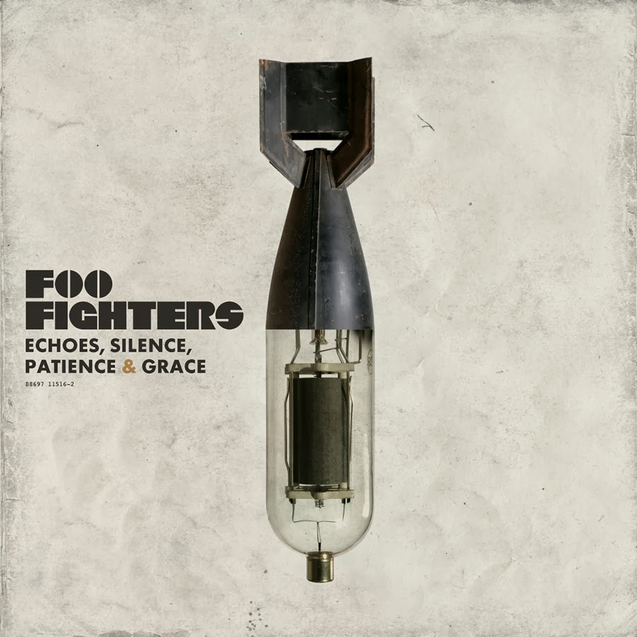
.jpg) Both of these album covers are clever. 'Souvenir' is actually a souvenir, it looks like a Brighton Rock. The colors are associated with joy and holidays. ESPG- I love the juxtaposition of the cover, the torpedo and the amplifier tube, two things not commonly associated with each other.
Both of these album covers are clever. 'Souvenir' is actually a souvenir, it looks like a Brighton Rock. The colors are associated with joy and holidays. ESPG- I love the juxtaposition of the cover, the torpedo and the amplifier tube, two things not commonly associated with each other. 
 I adore the simplicity of these two albums. The colours in both covers compliment each other and create gorgeous tones.The lighting in both is also very different, but effective. With The Smiths, it looks dramatic and cold, whereas the White Stripes look warm and dramatic in a different way.
No comments:
Post a Comment