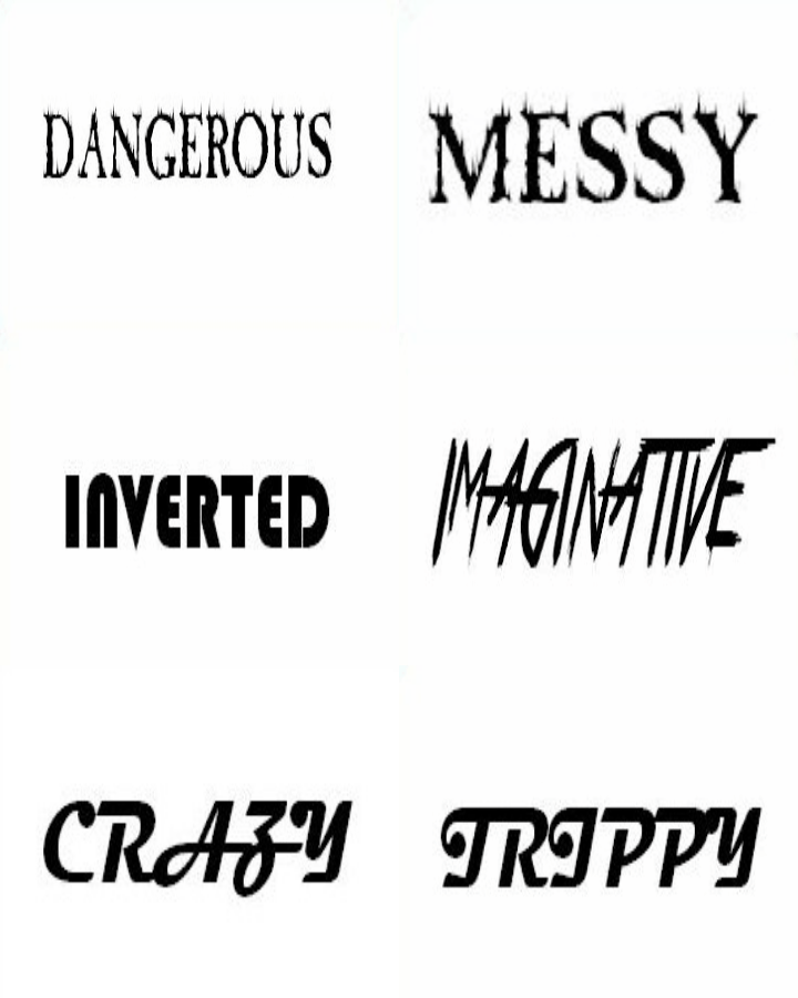
We asked our classmates to describe our advert in three words. In this GIF, each font represents a different person's opinion and each word in that font are the three words they suggested.
Upon receiving this feedback, I think we made the right decisions. These words are all words that we agree with, especially 'TRIPPY' and 'CRAZY'- that was the intended effect of making the colours so contrasting. The description of it being 'ORIGINAL' is also great- the indie genre is known to be original (the reason for it's creation). We certainly agree that it is original, neither of us had seen an album cover in this style before. 'COLOURFUL' is naturally the perfect description, it was our intent, feeding in to the description of 'TRIPPY'. In some ways I understand the adjective 'SIMPLE' in that it was a single photograph edited to a different colour scheme. 'IMAGINATIVE' is a wonderful compliment, we were definitely trying to break the boundaries with editing while remaining within the indie convention.

No comments:
Post a Comment