Sunday, 20 April 2014

First Draft Digipak

This is our finished album cover. I think it turned out quite well.


We decided that after making all the images vibrant, we would keep the CD as plain as possible. I think it's quite effective.

 These are again photographs that I took but with the gradient changed. We thought it would be a good idea to have completely different colours throughout. It emphasizes the drug/tripping element referenced in our album name, Mother Cocaine.

This a net of the final product. It is slightly squished due to Photoshop formatting. We like the contrast between the colours of the font cover and back.

Questions for target audience feedback:
- How would you describe it in three words?
- What do you like the album cover?
- What don't you like about the album cover?
- Do you think it fits with the conventions of the indie genre?
- Would you buy this album? Is is visually appealing?

Rough Cut Of Music Video

This the rough cut of our music video. This was (with some minor changes) how our music video was going to look/play. It is quite a lot longer than our final version, and some dodgy shots that we were advised to remove. It also has a lot more 'nature' shots which are media teacher said detracted from the narrative, so we removed them. The beginning is slightly different too- our final video starts with Ophelia walking in the forest and the 'break-up' scene is sped up to make it appear slightly unnatural. Furthermore, we did not add an effect to the scene as we did here. This way, it would make it appear more recent. We also changed the name of the band to avoid copyright issues and to make the ancillary more interesting. Several other shots have been cut as well due to shakiness or general 'wrongness'. We also had a huge continuity error with the hat (I had suggested we not use a hat to begin with because it would cause more issues, but Conall insisted it was "very indie"), forcing us to re-film certain shots.

Thursday, 17 April 2014

Introducing: Voice Full Of Money

After creating the band and putting them on various social networking sites including Twitter and Facebook, we chose to have a photoshoot of the 'actual' band to have profile pictures and photos for the digipak.
This required research into band photoshoots, clothing, poses and the like. Below are the results.

Firstly, I looked at poses and drew some rough sketches illustrating the variety. Purple are Mallory Knox, red are The Blackout, green are the Coronas and blue are Hurts. Through my research, I have discovered that pockets play an important role- members are commonly seen with their hands in their pockets or belt loops. I can only assume that this is to make that photo plus its subjects more interesting (less passive) and in some in cases, assert the 'manliness' of the members. It could also be interpreted as showing relaxation and carelessness. It is a challenge to see an image of a contemporary band without at least one member having their hands in their pockets.
 We decided to take photos of our 'band' in a different style, using the school stage in the canteen and the old parking lot to create an indie vibe. Below are the fruits of our labour.


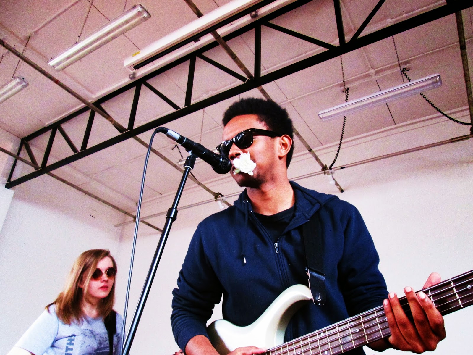
By comparison to the others, this shoot was a complete success. We had one girl and three guys in the band, making it more conventionally indie. Clothing-wise, (Emma wore her favorite Smiths t-shirt) everyone wore something that they already owned and would wear normally.  To make them all look 'cool' and slightly blasé, we asked our members to bring sunglasses- I think Emma's 'Lennon' ones work very well. Conall and Emma brought their guitars and we borrowed a bass and drum set to make 'the band' look more realistic. Although we shot mostly inside the canteen (some of the dining tables are in the background) I think the images look fairly realistic, even though most of them couldn't play a tune.
 Here, we posted tweets and uploaded images, making the band appear as real as possible.   The effect of this the breaking of the fourth wall between audience and production interaction. 'We' can now interact with the audience- they can tell us what they want, like, dislike and so on, with the second party being able to react directly, without the need of a middleman. Sometime however, this can go wrong and the interaction can go too far- see Jimmy Kimmel's 'Celebrities Read Mean Tweets' segment on YouTube.                                                                                                                                          


Wednesday, 16 April 2014

Album Art Analysis

Below are some examples of my favorite album covers.

I love the fonts/lettering used on these album covers.  Alphavilles' lettering helps create a futuristic, polished feel. Bon Jovi's takes its album name literally, writing it on a rain covered surface.                                                                                                        
The colours on these two album covers are what I like about them. Alice In Chains' dark palette with the human heart reminds me of bruises, probably the intended effect of the title: Black Gives Away To Blue. On Fall Out Boy's, the contrasts of the colours and textures is brilliant. The 'drawn' light/halo is reminicit of middle age book drawings.   
                                                                                                                                                          
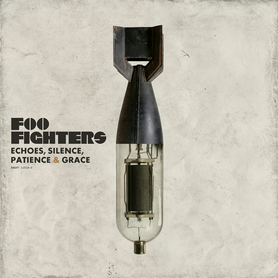
  Both of these album covers are clever. 'Souvenir' is actually a souvenir, it looks like a Brighton Rock. The colors are associated with joy and holidays. ESPG- I love the juxtaposition of the cover, the torpedo and the amplifier tube, two things not commonly associated with each other.                                                    

I adore the simplicity of these two albums. The colours in both covers compliment each other and create gorgeous tones.The lighting in both is also very different, but effective. With The Smiths, it looks dramatic and cold, whereas the White Stripes look warm and dramatic in a different way.


Album Advert Ideas + Inspiration

Style 1: Minimalist


I really like this style. It's simple, but very effective. It communicates all the necessary information clearly.The colour scheme is also very understated- it looks elegant and classy. Out of all the adverts I looked at, it had the simplest structure/layout to deconstruct, while also showing reviews that the album received. It also doesn't state the different formats the album would be released. Nonetheless, I like it alot.


Style 2: All Consuming


Unlike the above advert, this one uses the album cover (including the writing) as the dominant, all consuming image.It also includes the an image of the latest released single to encourage the audience to buy the album, along with other successful single tracks.It also includes digital means such as iTunes and an artist website. Unlike the AM ad, this features colours.
Style 3: Structured                                                                                                                                                  
This is the busiest of all the adverts, conveying the most information to the audience. Like all the adverts, it has the album cover/artist as the central image.Unlike the others, it has a specific release date, as well as the different release formats. I do like the different structured levels- album names, singles, formats, website. The concept of a boarder is also nice. However, it does appear slightly cluttered to me.           

Saturday, 12 April 2014

Tutorial: How We Made Our Album Cover

This is a tutorial explaining how we made our album cover, replicating the exact same process on our record company label. We will give you a step-to-step guide in how to re-create this funky image. Feel free to use a different image and different setting than we are showing. This tutorial was made using Photoshop on a Macintosh PC and recorded with Quicktime Player.


Step 1: Choose Your Image
Firstly, you need to choose an image to work with. We have chosen a panda because Conall felt the need to incorporate it, and something unusual is typically called 'indie', so it fits. In addition, it raises awareness in light of recent panda extinction awareness press. For the album cover, we chose two photographs that I took.

Step 2: Crop The Image
We naturally need to remove the 'comical' captioning of the image, simply leaving the image of a scared panda.


Simply select the cropping tool to the left side of the page and drag the sides of the box, so all of what you want to keep is highlighted, and the remainder is blacked out.
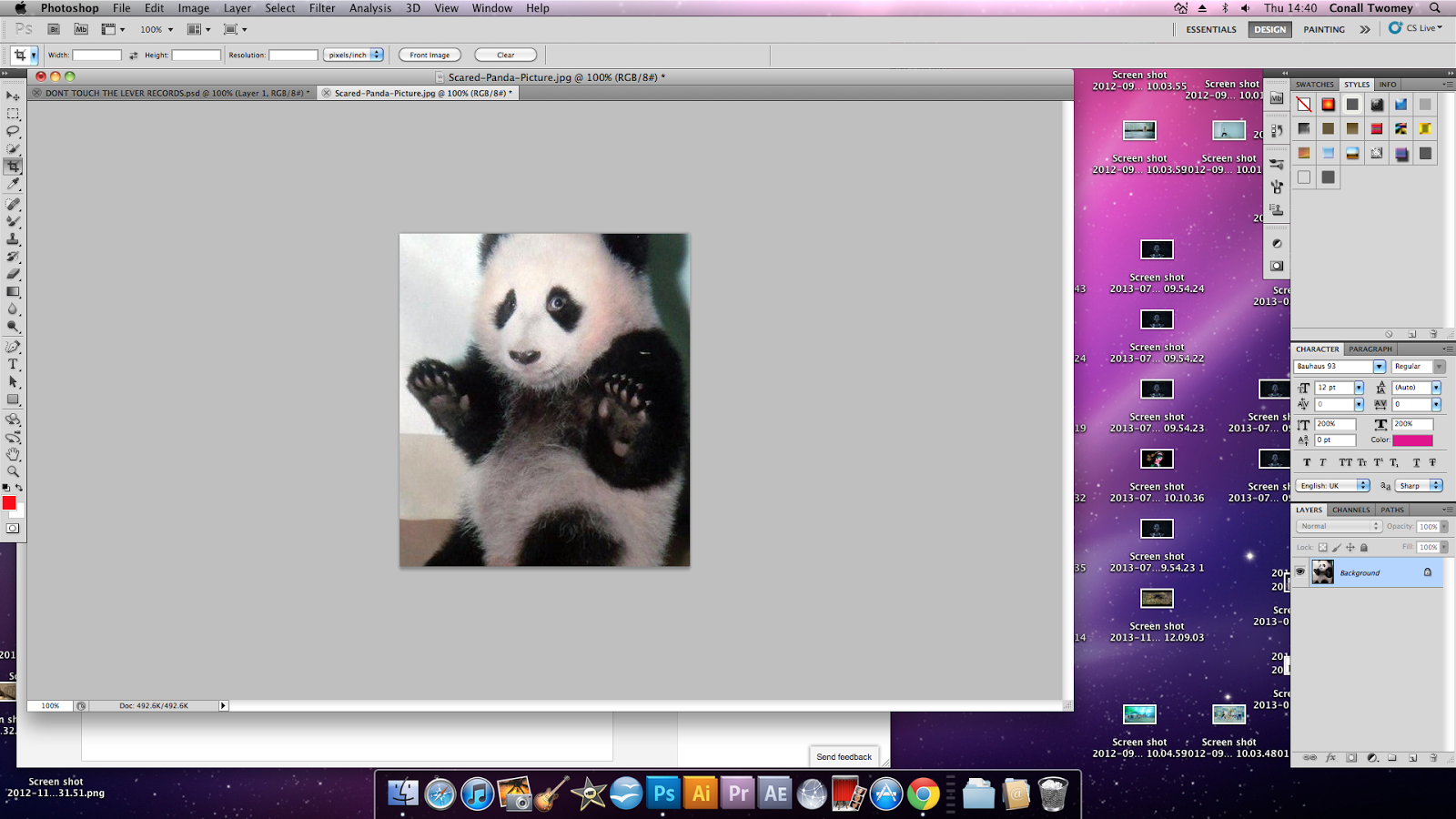


You should end up with something looking like this:


Step 3: Using Gradient Map
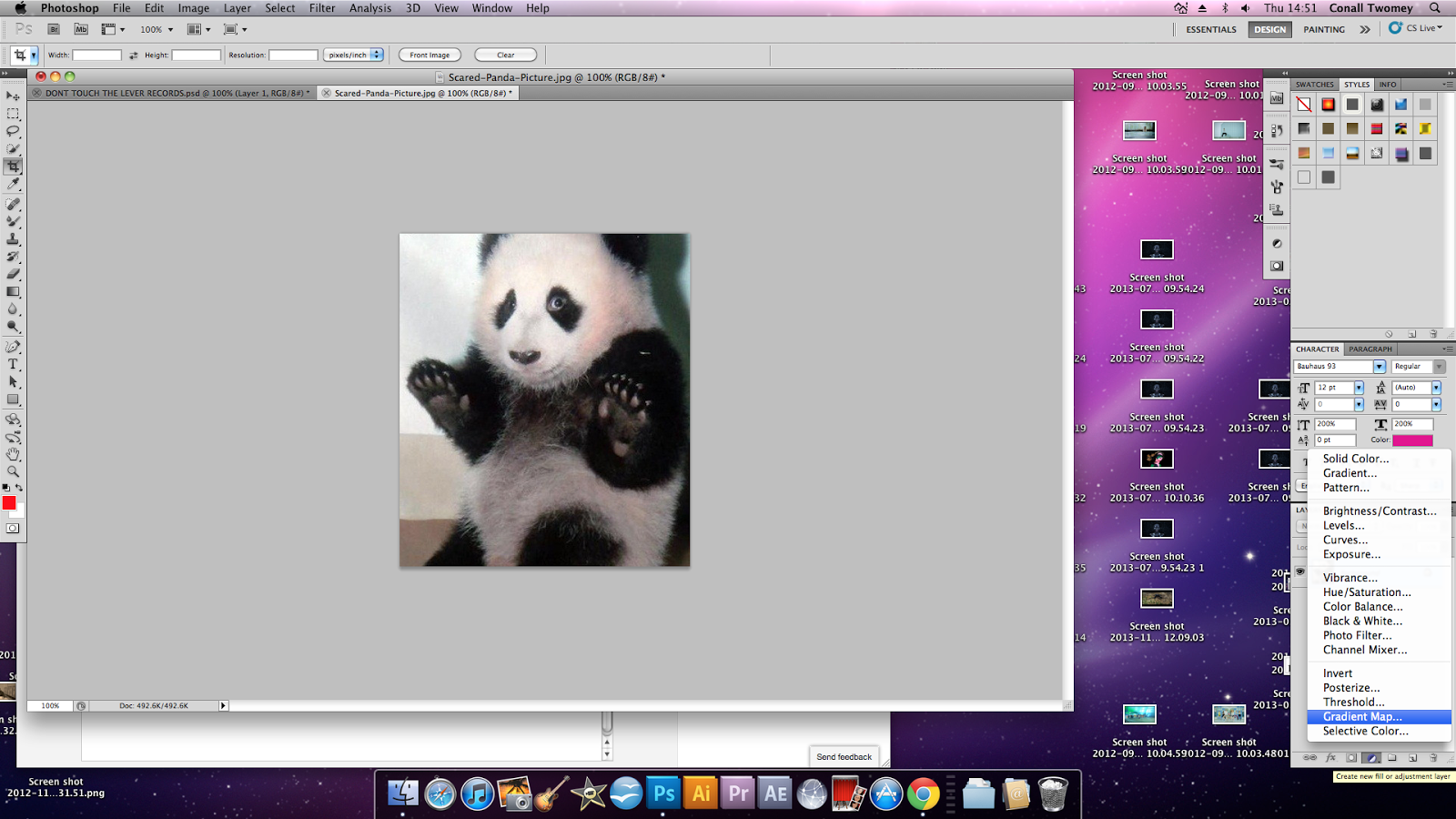
Next, click on the Fill or Adjustment Layer Button. Select Gradient Map from the drop-down list.
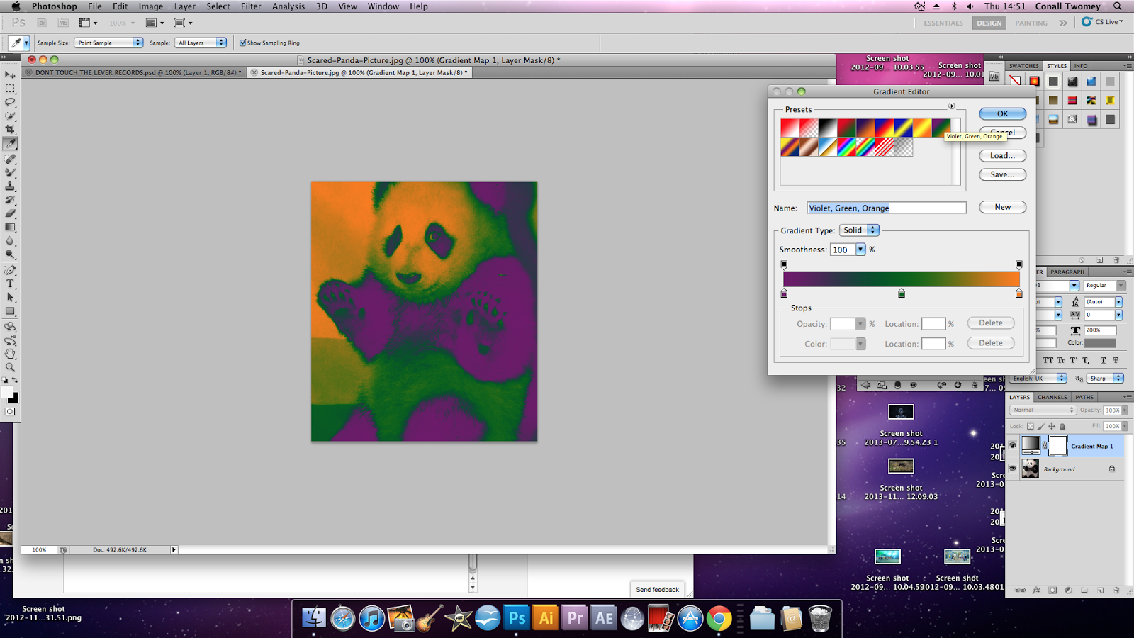


A wide palette of colours will appear, including a slider with all colours and a selection of gradients. To achieve the effect we need, select the Violet, Green and Orange option.


Step 4: Adding Text
Finally, click on the text button, "T", on the toolbar the left hand side of the screen. Choose what kind of text you want, the font, colour and where you would like it located. We went for a retro-disco like font in startling pink to contrast to the other bright colours we used. Here is the final result. We hope this tutorial was useful!


Friday, 11 April 2014

Using Instagram To Gain Feedback

Here, I uploaded pictures of our digipak onto Instagram to get further feedback from my inumerous followers (9), but something is better than nothing. Sharing our work through social networks breaks the wall between audience producers, a previously passive process has become more active. This concept of publishing album art to followers/fans is now established, with Foxes and Panic! At The Disco doing the same.