Monday, 5 May 2014
Sunday, 4 May 2014
Final Digipak
Here is our final digipak.

Inside Left Panel Inside Right Panel and CD
 Inside Right Panel Inside Left Panel Without CD

Front Cover
Inside Left Panel Inside Right Panel and CD
Saturday, 3 May 2014

Friday, 2 May 2014
Evaluation Question 4: How did you use media technologies in the construction and research, planning and evaluation stages?
All of the technical work done on our three media products was completed on our school's Macs and we spent the majority of year in the school Mac suite. They were all installed with all the programs we would need including iMovie, iPhoto and Photoshop, among others. All of these programs were very useful in every stage of production of all our tasks. iMovie and iPhotos straightforward set was made them very easy and quick to use and if we did encounter a problem, the internet showed us how to resolve it. I took me a while to get to grips with Photoshop (I often required the assistance of a classmate), but I eventually learned and managed to use it fairly effectively. Without the school Mac suite and its programs, our products would not be the standard that they are.

 The main pieces of equipment we used was naturally the camera and tripod. Although the school provided us with a camera, we decided to use mine (a Canon PowerShot A2200) as it filmed in better quality, had more space and could more easily be attached to the tripod. We used this camera to film the whole music video and we liked this camera as it had great focus and picture quality considering how simple the camera is.
 Importing clips from the camera was also simple, which made our lives much easier. Altogether, we used three tripods: two of mine, and one from school. Base plates were a constant issue, as were height and panning capabilities. Height wise, the school tripod was the best, but for low angle shots, smooth panning and a stable camera, mine were better, even considering one was from the DDR! The school one was also extremely useful as it had a spirit level, allowing us to make sure our shots were all level.
 We used iMovie to edit the whole of our video, and offered almost every possible variable. If access to iMovie had not been possible, the quality and professionalism of our video would have been much less. Within the program, we could cut our clips precisely and add the music quickly and without hassle. It also enabled us to add effects, such as vignette, over our walking in the forest shots. Another critical 'gadget' within iMovie that was incredibly useful was the 'white point changer'. With this, we were able to add green overtones to all of Ophelia's scenes to further emphasize her connection to nature. For Hamlet's scenes, we changed the white point to a blue colour, to show how cold and desolate his life is without Ophelia, but during his scenes with Fintan, we altered it to an orange colour, indicating warmth and comfort.
 Photoshop was used to create the digipak and digipak advert. Without the advanced picture editing software
we would have had to use Paint or a similar program, which is the most basic tool for picture editing and our products would have suffered in doing so. With Photoshop, we were able to erase flaws, add photographs, crop pictures and edit several images at once. Although it was difficult to use at first, its extreme technicalities and details, although good, took a while to learn and get used to. However, if we had problems, the internet could provide us with answers.

YouTube was the website where we posted all the videos we created: make-up tutorials, rough cuts, final version. It is the perfect site to upload a video to, as most people have access to it and it is so well known. However, as it is so popular, there are thousands of videos uploaded everyday, so we doubt our video will receive many views. Its use of commenting and rating systems allows us to have direct interaction with our audience, something that several years ago would not have been possible.
 Blogger was the website most used over the year. It was here that we posted all our ideas, research, planning and final pieces. I really enjoyed constructing a blog that looked good and contained the work we needed to succeed- it was really fun and after completing most of the work, felt like an accomplishment. However, as we filmed and began to edit our videos, our blogs were sometimes forgotten, so please excuse a rushed post here and there. Blogger has been the best platform for blogging (with the exception on Tumblr) as it is simple to use and offers a variety of post options: you can upload photos, do text posts, embed videos...what ever you like. It also has the handy option of 'drafts'- if you made a mistake or want to change something without deleting the whole post, revert to draft, and change it. It makes aesthetics take a side seat, although you can choose your background, making it less distracting to do work.
All of these sites contribute to what is called Web 2.0. Web 2.0 describes World Wide Web sites that use technology beyond the static pages of earlier Web sites. Unlike websites before, it allow users to interact and collaborate with each other in a social media dialogue as creators of user-generated content in a virtual community, in contrast to Web sites where people are limited to the passive viewing of content. Examples of Web 2.0 include social networking sites, blogs, wikis, folksonomies, video sharing sites, hosted services, Web applications, and mashups. By using these interfaces, we have changed the way we communicate with others, there are no barriers, or at least there are less than there were 10 years ago. We have made ourselves incredibly public by using sites such as Blogger and YouTube, allowing others to almost directly contact us with their opinions- the middleman has been eliminated.
The main pieces of equipment we used was naturally the camera and tripod. Although the school provided us with a camera, we decided to use mine (a Canon PowerShot A2200) as it filmed in better quality, had more space and could more easily be attached to the tripod. We used this camera to film the whole music video and we liked this camera as it had great focus and picture quality considering how simple the camera is.Importing clips from the camera was also simple, which made our lives much easier. Altogether, we used three tripods: two of mine, and one from school. Base plates were a constant issue, as were height and panning capabilities. Height wise, the school tripod was the best, but for low angle shots, smooth panning and a stable camera, mine were better, even considering one was from the DDR! The school one was also extremely useful as it had a spirit level, allowing us to make sure our shots were all level.we would have had to use Paint or a similar program, which is the most basic tool for picture editing and our products would have suffered in doing so. With Photoshop, we were able to erase flaws, add photographs, crop pictures and edit several images at once. Although it was difficult to use at first, its extreme technicalities and details, although good, took a while to learn and get used to. However, if we had problems, the internet could provide us with answers.
YouTube was the website where we posted all the videos we created: make-up tutorials, rough cuts, final version. It is the perfect site to upload a video to, as most people have access to it and it is so well known. However, as it is so popular, there are thousands of videos uploaded everyday, so we doubt our video will receive many views. Its use of commenting and rating systems allows us to have direct interaction with our audience, something that several years ago would not have been possible.
All of these sites contribute to what is called Web 2.0. Web 2.0 describes World Wide Web sites that use technology beyond the static pages of earlier Web sites. Unlike websites before, it allow users to interact and collaborate with each other in a social media dialogue as creators of user-generated content in a virtual community, in contrast to Web sites where people are limited to the passive viewing of content. Examples of Web 2.0 include social networking sites, blogs, wikis, folksonomies, video sharing sites, hosted services, Web applications, and mashups. By using these interfaces, we have changed the way we communicate with others, there are no barriers, or at least there are less than there were 10 years ago. We have made ourselves incredibly public by using sites such as Blogger and YouTube, allowing others to almost directly contact us with their opinions- the middleman has been eliminated.
Thursday, 1 May 2014
Evaluation Question 3: What have you learned from your audience feedback?
Music Video
We have a rough cut of our music video and one of the main criticisms was the clarity of our narrative.This was pointed out to us my classmate viewers as well as teachers, who felt that although we had beautiful, pastoral 'photograph' like shots, they did not contribute to the narrative, rather, they obscured it. So, we needed to find a way to make our narrative more explicit and keep the beautiful nature shots while making them relevant. Below are further other critiques:

Conall's run was also a major issue. As he plays Gaelic football, he has been trained to run in a certain way, and that could be seen in our rough cut. We made him take 'running lessons' from a fellow classmate who told him to take inspiration from the way Tom Cruise runs, his arms are very active, they do most of the work, while the legs simply run normally. I have included the video that we made him watch. Due to this, we needed to refilm almost all of Conall's running scenes, which posed the problem of different weather. Luckily, the weather was mostly compatible with the scenes we needed to film.
A further issue that narrative posed was the 'homosexual' element. Some people felt that Conall's relationship with Fintan was left unresolved and that Fintan's appearance was only a plot device. Our teacher felt that an extra scene needed to be added of the two together to cement their relationship and to show that Ophelia was not involved and they were the direct cause of her death. We had intended to add this scene at the beginning to show them enjoying themselves without her while she went insane, but we felt it fitted better as an ending sequence. It showed that Hamlet had tried to save her but couldn't, and now his new life continues, regardless. After making these various changes, feedback improved:

The criticisms we received were ultimately helpful because they aided us in creating a better music video. If they had not pointed out these various flaws, we most likely would never have noticed and changed them for the better. Their feedback have benefited our video incredibly and made it seem more professional.
Digipak
We created our digiapk using Photoshop. It is slightly less organized due to time limitations, so we only had a draft and a final.
 |
| INSIDE |
 |
| BACK |
 |
| FRONT |
This is the feedback we received from our first draft above. In order to get this feedback, we asked people in our age group (our target audience) to give honest feedback for the first and the latter, commenting on the change.

Some people felt that the CD did not look like a CD (with which we now agree) and needed to be re-done. Also, some thought that the colours inside were too much, the images interfered and detracted attention. Our media teacher also felt that the band needed to be present, so we had a photoshoot in school with instruments and the like. Below is the final version:
 |
| INSIDE |
|
| BACK |
|
| FRONT |
This is the feedback we received after we made the changes.
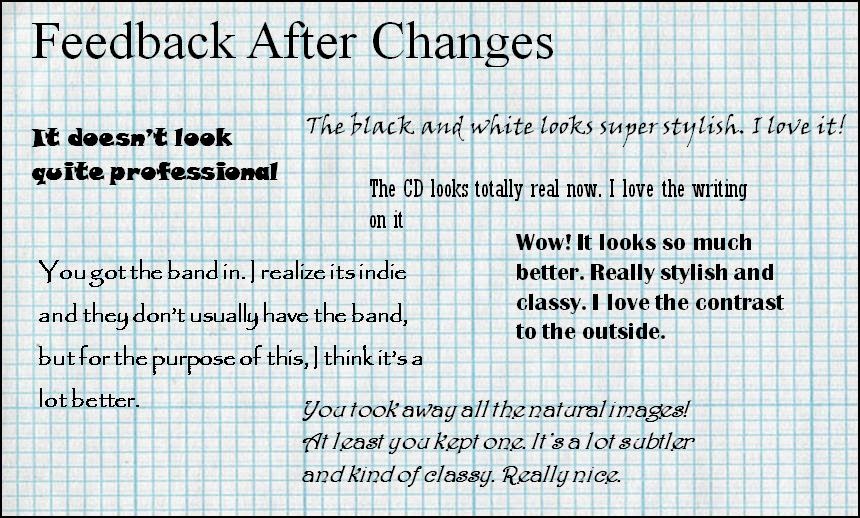
The feedback after we changed the inside was so much more positive. People responded really well to the contrast between the black and white inside and the colorful outside, with several saying they preferred it that way with band, stating "it felt more indie". There was an issue with having the band in the digipak and writing on the CD. On almost all the indie/alternative CDs and digipaks we viewed, artists were commonly absent to emphasize the importance of the music rather than the personage of the artist. In addition, the writing on the CD detailing producers and the like were often not included for a variety of reasons. Often, the artist, like Gotye, does everything in the production stage himself and therefore does not require this list. Other times the writing is omitted to show that the artist does not want to promote companies or does not want to be associated with corporations. However, sometimes this omission is simply stylistic.
Advert


Wednesday, 30 April 2014
Evaluation Question 2: How effective is the combination of your main product and ancillary texts?
I made this video using iMovie to answer this question. Apologies in advance for any mistakes- it was constructed in a fairly short space of time.
Tuesday, 29 April 2014
Sunday, 20 April 2014
Album Advert Target Audience Feedback

Upon receiving this feedback, I think we made the right decisions. These words are all words that we agree with, especially 'TRIPPY' and 'CRAZY'- that was the intended effect of making the colours so contrasting. The description of it being 'ORIGINAL' is also great- the indie genre is known to be original (the reason for it's creation). We certainly agree that it is original, neither of us had seen an album cover in this style before. 'COLOURFUL' is naturally the perfect description, it was our intent, feeding in to the description of 'TRIPPY'. In some ways I understand the adjective 'SIMPLE' in that it was a single photograph edited to a different colour scheme. 'IMAGINATIVE' is a wonderful compliment, we were definitely trying to break the boundaries with editing while remaining within the indie convention.
Final Video Feedback From Target Audience


Generally the feedback we received from this useful and true, it corresponded to our own thoughts about the final product. It was nice to see that many people understood the Hamlet/Shakespeare reference and saw the parallels in the narrative, with people offering different views on the homosexual element. The nature shots were generally well received, but some felt that they were excessive, while others enjoyed them. Overall, the reaction was strongly positive.
Subscribe to:
Comments (Atom)